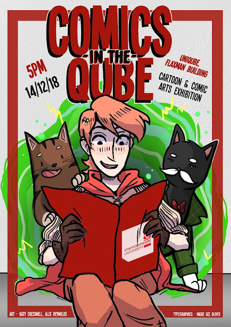
With our work from this semester being exhibited in the UniQube, our class split into small teams ro create posters promo-ing the opening night! Katy and I teamed up with Alex (starsinmycoffee) to produce our little poster that incorporated our characters, the uni, comics, and all the relevant information.
Below, you can see what I was sent by Katy and Alex to add my design elements to. I think they did a really great job with the illustrations and was immediately really excited to have a play with adding my work to it!
With my job in marketing, it made sense for me to work on the graphic design and typography. I really liked the plain background with the portal, so I just added a wall texture to it, and reduced the opacity of the portal over the top. As for the font, I chose a very stereotypical 'comic title' font, added harsh shadow and outlined it by hand. I also added a thick red border to tie the colours together more with the university branding.
Something that I personally really wanted to play with in this was closer, more clustered text, as my typography is usually quite spaced with wide kerning, so I wanted to go out of my comfort zone a bit. I'm really happy with how this worked out! As well as this, I wanted to go with the magazine masthead style of putting the characters in front of the text, but the rest of the image behind. I really love how our poster worked out in the end!


No comments:
Post a Comment