All in all, I think this semester's work has gone really well for us! I'm finishing up this semester feeling that the project was a real success. But, naturally, I really want to learn from this project to take into next semester.
Key Points for Next Semester:-
- Continue working within a creative team.
- Continue with the educational prominence in our work.
- Continue to include the animated elements.
- Try again with app creation next time.
- Focus more on narrative, and maybe make the education slightly more subtle.
- Dedicate more time to create a really extravagant exhibition space.
- Possibly aim at a slightly higher age range.
Wednesday, 12 December 2018
Self-Evaluation: Reflection, Analysis and Problem Solving
As is the nature of such a self-directed project, this semester a lot of self-criticism for me. Without having the constant feedback of a lecturer that comes at lower levels, I've really feel I've learnt to look at my own work in a more critical way and really pick out elements that need improving or altering. As previously mentioned, this affected my writing after the very first page!
Another example of how I've learnt to filter my work based on my own critiques is the development of my graphic pieces for the covers and inside cover. In the posts detailing how these elements came to be, you can see how many variants I had to go through, using my own critical thinking to make sure I really made the best result I could.
As much the independence is something that I've prioritised here, taking outside feedback is obviously still very relevant! Having the industry panels, in particular, was really useful for gaining an alternate (and professional) opinion, and I think their comments (particularly during the mid-project presentation).
Self-Evaluation: Communication
Communication has been a huge part of my project this semester. Not only have I had to think of communicating my work to my readers, my lectures and my peers. But, as previously said, communication between Katy and I has been absolutely crucial this semester. I've really developed my written communication skills through this semester, purely due to the volume and importance of things I had to explain to show my work.
As well as this, I'm really proud of my vocal communication this semester. Though I was - understandably - very nervous to do both of my presentations in front of the industry panels, but I'm really happy with how these went! I think I managed to get across everything that I wanted to, and took and discussed their feedback very naturally. Because of how worried I was about this element of my project, I'm really proud of myself for managing it as I did!
As well as this, I'm really proud of my vocal communication this semester. Though I was - understandably - very nervous to do both of my presentations in front of the industry panels, but I'm really happy with how these went! I think I managed to get across everything that I wanted to, and took and discussed their feedback very naturally. Because of how worried I was about this element of my project, I'm really proud of myself for managing it as I did!
Tuesday, 11 December 2018
Self-Evaluation: Enquiry/Knowledge and Understanding
Throughout this project, I have had to keep myself on track with ensuring that everything I'm doing is not only done in the most efficient way possible, but also is done with producing something relevant and important in mind.
By this, I mean that I really had to hone my skills which elements of my current knowledge and practice were most relevant to the project, and would bring value to the project. As well as this, It was important to ensure my work was informing my future career, so as I was working through the module, I had to push myself and experiment with elements that I thought made me more employable (more of this can be found in my 'The Future' post, a few posts back).
Another side of this is research. I had to make sure that all research I conducted (can be found throughout my earlier posts, predominantly, with all secondary research referenced in the 'Useful Links' post) was relevant to my work and helped my project progress in the most successful and professional way possible.
Self-Evaluation: Learning
In a project as self-directed and independent at this, learning and building knowledge is absolutely crucial. In the very nature of this (working in a creative team and producing something entirely of our own planning, with no pre-defined guidelines) being something new for me, it meant I had to learn to adapt to a lot of new situations that I hadn't pre-planned for.
As well as this, during this project, I've had to develop and expand my knowledge of prose and script-writing to ensure that it was extremely clear to another person (when previously I've only been script writing for myself). This means I've had to adapt my writing style to be more descriptive, and learn that it's okay to reference examples of what I'm looking for from a page! I specifically had to alter my plans and communication during the production of the comic when - after the first page of script was given to Katy - she altered it entirely, causing me to realises that I'd made my panels too flat, and alter this entirely for the rest of the comic (this issue was never a problem again after this).
Another example of learning I've had to undertake has been the actual, direct learning of teaching myself more in-depth knowledge of art history to ensure it was communicated accurately, correctly and - most importantly- in an engaging manner for my readership.
The Future: Applying this Project to My Career
One of the key features of this project was that we wanted to be able to use it to help us towards our future career goals. As I'm not certain about my intended career at the moment, I wanted this project to give me experience in numerous areas of interest...
Comic Writer:-
Understandably, one of my biggest career options is heading into the comic industry as a writer or editor. One of the reasons I wanted to work with Katy is that this is a more likely experience to get into in the industry (group work instead of doing everything yourself), and wanted to be able to add that I'd worked both independently (last semester) and in a creative team to my portfolio. As well as this, in recent weeks I've been applying for writing internships for over the summer. For this, I had to construct a writing portfolio, and I think having this work and experience could really set me apart from other applicants.

Teaching:-
I've always had a keen interest in teaching as a career. Because of this, you can see that most of our initial ideas had a strong educational element. This comic itself was probably our most directly educational idea and I'm really glad we got to explore it. I really enjoyed trying to water down and translate the information into something that a younger person would find really engaging, it was a really great challenge and pushed me to learn a lot about my target audience.
Social Media, Marketing and Graphic Design:-
An industry I know I'd fit into well is digital marketing. I've always had real success with social media, and wanted to test that in a more structured manner in this project (hence; the Twelve Days of Christmas idea). As well as this, I've always been interested in the graphic design side of marketing, so the majority of the typography, design and marketing work in this project was done by me to bulk up my portfolio and let me practice new styles and hone my skills.
Exhibition Final Touches
Tomorrow we will add the finishing touches to our exhibition space. Firstly, we intend to a book stand with a few copies of our book in it so that people can flick through our work and test our QR codes for themselves whilst using a third party barcode scanner (as I recommended in the blurb I'd previously written). As well as this, when the UniQube was first spoke about, we brought the idea up of having a screen to display the animations on (as these are obviously a key element of our comic). Below you can see this initial discussion about this I had with Claire...
 In the end it was decided that we would have one big screen in the Qube to be shared between everyone who wanted digital work displaying. But, when Katy asked everyone to send their digital work across, no one had anything. So, in the end we found ourselves with a screen of our own so we are just play our full comic on loop for the duration of the opening night!

Final Social Media Summary
As of today, My twelve days of Christmas only has one more post to do, that I can't do until just before deadline tomorrow. Below, you can see how it's gone so far...

As well as the twelve days of Christmas on the Comic Nest accounts, I've also been working on promo-ing my work and our UniQube exhibition through my personal accounts and the official Staffordshire University accounts that I have access to through work. Below, you can see a post from my personal Instagram story, and a tweet on the Staffs Students account that has been retweeted to the main Staffs Uni page...


As well as the twelve days of Christmas on the Comic Nest accounts, I've also been working on promo-ing my work and our UniQube exhibition through my personal accounts and the official Staffordshire University accounts that I have access to through work. Below, you can see a post from my personal Instagram story, and a tweet on the Staffs Students account that has been retweeted to the main Staffs Uni page...


Friday, 7 December 2018
Designing a Poster in a Group
With our work from this semester being exhibited in the UniQube, our class split into small teams ro create posters promo-ing the opening night! Katy and I teamed up with Alex (starsinmycoffee) to produce our little poster that incorporated our characters, the uni, comics, and all the relevant information.
Below, you can see what I was sent by Katy and Alex to add my design elements to. I think they did a really great job with the illustrations and was immediately really excited to have a play with adding my work to it!

With my job in marketing, it made sense for me to work on the graphic design and typography. I really liked the plain background with the portal, so I just added a wall texture to it, and reduced the opacity of the portal over the top. As for the font, I chose a very stereotypical 'comic title' font, added harsh shadow and outlined it by hand. I also added a thick red border to tie the colours together more with the university branding.
Something that I personally really wanted to play with in this was closer, more clustered text, as my typography is usually quite spaced with wide kerning, so I wanted to go out of my comfort zone a bit. I'm really happy with how this worked out! As well as this, I wanted to go with the magazine masthead style of putting the characters in front of the text, but the rest of the image behind. I really love how our poster worked out in the end!

UniQube Exhibition Progress
While Katy was finishing up her animation, it was my responsibility to organise the exhibition layout. Initially, I had lots of discussions with Claire about what was and was not possible to include, to ensure our exhibition space was in keeping with everyone else's. For example, as our comic is set in a museum/art gallery, we wanted to use real frames, but Claire advised against this. To combat this, we decided to create frames out of foam board, so it was still technically in-keeping.
Initially, I drew up a plan of the layout I wanted for the work, to send through to Claire to get her approval and ensure it would work in the UniQube...


Initially, I drew up a plan of the layout I wanted for the work, to send through to Claire to get her approval and ensure it would work in the UniQube...

Once our layout was signed off by Claire, It was down to deciding on the content. For the script + matching page, I chose page 14, as this page wasn't changed too much from my original script, and was short enough that the script all fit on one page. This was also the time when I wrote the blurb, which I actually found really difficult! While writing the comic description was easy, I found the paragraphs about Katy and I really difficult to work with and add the right information into.
Once everything had been decided on, I wanted to retest the layout with the actual images, which you can see below...

After this, it was just a matter of printing and mounting on foam board. As we'd already planned to prop out the bulk of our content with one extra small prop of foam board below it, Katy and I discussed it and decided to use two layers of little prop pieces on the frames, so that they stood out more, like actual frames.
You can see the final, fully mounted display below...

Wednesday, 5 December 2018
Other Design Elements
Katy and agreed at the start of the project that I would cover graphic design responsibilities, as well as sorting any little elements we forget to mention in the initial plan. This lead to me being responsible for the inside covers, extra pages, and back cover.
For the extra pages and back inside cover, we utilised the other cover ideas Katy had had initially. The original plan was to have matching inside covers, front and back, but when I was experimenting with Katy's alternative covers, I found the wraparound idea she had would work perfectly across the back page and inside cover. I then added a little of my altered typography to the other idea to make it into a sort of final page (below).

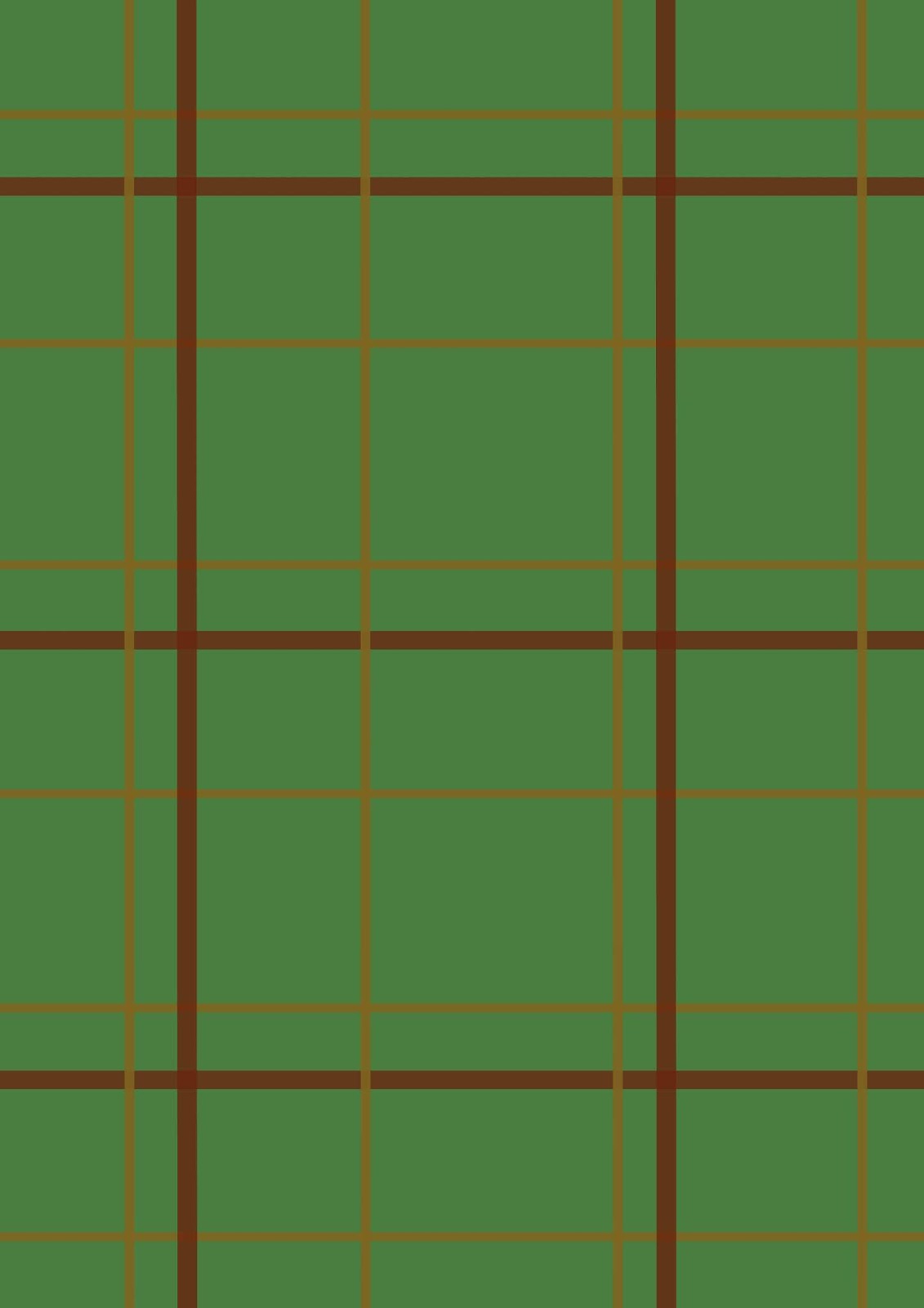
After this, I focused on the inside cover design. I knew I wanted this to be fairly simply, as it lead straight into the first page. For this, I thought of the key imagery I could associate with our book - portal, Gord's coat, paw prints, frames - and started playing with ideas. Firstly, I made a tweed tartan texture (below).

From here, I wanted to try setting a paw print into the texture. So I drew up a basic print and used a gradient tool to give it a bit of depth (below). After this, I found I really didn't like the final result, and it didn't at all line up with the idea I had in my head.


For the extra pages and back inside cover, we utilised the other cover ideas Katy had had initially. The original plan was to have matching inside covers, front and back, but when I was experimenting with Katy's alternative covers, I found the wraparound idea she had would work perfectly across the back page and inside cover. I then added a little of my altered typography to the other idea to make it into a sort of final page (below).

After this, I focused on the inside cover design. I knew I wanted this to be fairly simply, as it lead straight into the first page. For this, I thought of the key imagery I could associate with our book - portal, Gord's coat, paw prints, frames - and started playing with ideas. Firstly, I made a tweed tartan texture (below).

I then came up with the idea of using this page for dedications. I had a think of how best to approach this, and decided to work with the idea of it being Gord's coat, and add a label. For this, I searched for some free for commercial use, no credit textures and set them into my initial layout. I then added little stitches and a bit of tone to make the label stand up. This led me to the final inside cover that you can see below. I'm really proud of this, actually, and think it really works with the theme of the comic.

After this, I focused on the back cover. Initially for this, we had just planned to have it mainly blank (probably black with our contact information at the bottom). But I decided to have a think before settling on this and came up with the idea that - because the from cover is 'framed' - the back cover should be the back of the frame. For this, I had to do a little research into what vintage framing looked like. I used Katy's frame, drew a paper layer over it slightly (and added a royalty free texture), drew in and hand textured some rope and metal fixtures, and then had to consider where we'd put our contact info. I decided it would be cool to have it on a sticky label that had been partially removed, to make it look old. I drew this us myself but using a white rectangle and using an airbrush eraser and fiddling with opacity a bit. Finally, I added the text and a royalty free Instagram logo. You can see the final back cover below.

Cover and Masthead Ideas - Final

This is our completed cover. I used the same font throughout (something I hadn't originally intended to do), and outlined it by hand each time to give it more character. All in all, I'm very happy with how my typography worked out in this cover and I think the masthead works well with the cover, but also stands alone quite well.

Cover and Masthead Design - Development
While I stated in my previous design post that the font used is too 'spooky', I came up with the idea of using this font to make it look like the painting was torn away to show the wood below. You can see the variations of this below. While I can sort of see how this idea would work, it really flopped with the cover we chose. It blended in far too much and just looked really unprofessional.


After this, I chose a new free-for-commercial-use font and started experimented with this. I personally found this really flat. To combat this, I decided to try playing with the texture and colour of the shadow, and integrated some brighter colours (specifically the colours of the time portals). While I loved the use of extra colour (below), I still felt it was really lacking.

Because of how long I'd worked on this with no success, I decided to go back and do some research into how other people appealed to the same, young demographic as ours with their logos. I noted a lot of them had a large, block background that the text was set over. There also seemed to always be a lot of movement in the mastheads/logos too, as shown below.

I then utilised this research and applied it to my next designs. For these, I asked Katy to doodle me some portals, selected the one I felt fit the best with the balance of the cover, and then overlayed my text and lined it in the same green as the base portal (you can see this initial design on the left). I then flipped some colours around to see what worked best and settled on white text with a black border (bottom). I also consulted Katy at this point, who agreed with my decision.


Despite being really satisfied with this design, I wanted to test a few more things out to make sure I wasn't missing out on a potentially better design! For this, I started to have a play with gradients (below). I eventually decided that these looked a little too generic and stereotypical.


Tuesday, 4 December 2018
App Finalisation - What Went Wrong
At this point, as stated was a possibility at the start of the semester, I am having to push the app to the side. While it was a nice to have a play, due to how small my budget was and how little time I had to learn coding/app building, it wasn't a very realistic expectation that things would pan out flawlessly.
The main issue I encountered was actually privacy issues with the app builder I used. Though it sold itself as being quick and simple to publish your app once you paid the subscription fee, it was the opposite of this. Upon subscribing (for £15 for just one month), I found that there was no way I could download my app and publish it in the Google Store myself (despite them advertising this), and instead I would have to provide all login and access information for my personal Google Account, which I was understandably uncomfortable with.
However, I did manage to download a test of my app before cancelling my Appy Pie subscription. It worked exactly as intended, meaning that when I have the time, money and external assistance, it's immediately ready to publish! You can see a video of this below (click the video title for better quality)...
Exporting the App from the Builder
The most difficult part about creating the app was actually the publishing, something my previous research did not imply. Appy Pie was just as user un-friendly as I'd previously found, and it made exporting the application almost impossible.
This was a really draining - and expensive - process, but some screenshots of the final app can be seen below...


This was a really draining - and expensive - process, but some screenshots of the final app can be seen below...


Monday, 3 December 2018
Social Media Promotion
Promotion is a really important part of creating anything that's to be sold, and nowadays, social media is a huge part of this. Because of this, I decided to revive the old Comic Nest account that Katy and I helped to run last year. Once Katy and I had settled on working together this summer, we asked the rest of Comic Nest if they'd be okay with us utilising the account, which they all agreed to.
THE CONCEPT:
- 12 consecutive posts.
- Instagram and Twitter.
- Rhyming.
- In the theme of '12 Days of Christmas'.
- Full reveal on final day (deadline/exhibition day).
- Small images/clues towards the comic.
- Very game-like (hopefully making it engaging for readers).
- Retweeted by personal accounts, as well as an official Staffs Uni account, to expand reach.
POST EXAMPLES:


Sunday, 2 December 2018
Creating the Animations: Finale
This was another really tricky one, as the wink was so subtle.
1) Crop down to the selected bit.
2) Crop canvas to remove grey background.
3) Slow entire clip to 20%.
4) Split and slow wink to 10%.

1) Crop down to the selected bit.
2) Crop canvas to remove grey background.
3) Slow entire clip to 20%.
4) Split and slow wink to 10%.

Creating the Animations: Modern
This one was a bit tricky to work out where to focus on, as the bit I had intended to focus on wasn't as long as I'd anticipated, which lead me to having to experiment a bit, before I finally settled on what I wanted...
1) Cropped to chosen section.
2) Slowed the focal bit to 70%.
3) Cropped canvas to remove grey background.
4) Edited positioning on the clip.

1) Cropped to chosen section.
2) Slowed the focal bit to 70%.
3) Cropped canvas to remove grey background.
4) Edited positioning on the clip.

Creating the Animations: Surrealism
This is probably our favourite animation, as it really adds to the surrealist feel!
1) Crop to correct length.
2) As this animation was quite short, I had to slow it to 45% to make it fit.
3) Slowed the final position to 30%.

1) Crop to correct length.
2) As this animation was quite short, I had to slow it to 45% to make it fit.
3) Slowed the final position to 30%.

Creating the Animations: Cubism
This is another fairly easy one, camera movement-wise.

1) Crop to the right length.
2) Slow to 70% to fill out 5 seconds (the consistent length of all the animations).
3) Cropped canvas to remove grey background.

Creating the Animations: Impressionism
This was a tricky one, because - despite the QR code being in the top left of the page - the animation I wanted to include was in the bottom. I talked this through with Katy and we agreed this should be fine and not affect how the book was consumed.


1) Crop to the right length, being very considerate of the fade into the next page at the end.
2) Slow the whole clip to 45%.
3) Slow the final shot to about 20%, just to elongate it a little.

4) Crop the frame so that the grey borders don't show in the animation.

Creating the Animations: Middle Ages
This one was really easy. It only required some clever cropping to avoid the camera movements.


Creating the Animations: Egyptians
This is one of my absolute favourite animations - as it shows PMT getting pats!
1) Crop down to correct length.
2) Slow to 70%.
This animation didn't need much adjustment, as the camera stayed on it for plenty of time.

1) Crop down to correct length.
2) Slow to 70%.
This animation didn't need much adjustment, as the camera stayed on it for plenty of time.

Useful Links
During every project I am a part of I like to keep a list of useful links that have helped me throughout, so that they are easier to refer back to, should I need them. Whenever this list is updated, the post date will be changed so that it's easier to access as the blog gets fuller.
Artist/Writer Relationships:-
- Kieron Gillen and Jamie McKelvie on comic creator relationships; https://youtu.be/NQYmDH_PoQU
- Classic comic duos who've worked well together; https://www.pastemagazine.com/blogs/lists/2012/06/15-most-influential-comic-creator-duos.html
- Forum on trust between writers and artists; http://forums.millarworld.tv/t/the-artist-and-writer-relationship/9675
App/QR Development, Initial Reading:-
- Making a QR reader app; https://youtu.be/I1z2oOh8S1o
- Making a barcode reader app; https://youtu.be/mgxNS8hwQQY
- QR codes in marketing; https://neilpatel.com/blog/genius-qr-codes/
- Tips for app development; https://blog.edx.org/15-tips-tricks-android-app-developers-2017
- Creating a Play Store developer account (to publish an app on the play store); https://help.swiftic.com/hc/en-us/articles/201709571-Create-a-Google-Play-Developer-Account
Potential External Contacts for 'George and the Dragon':-
- Websites for empowering young girls (possible people to work with); http://www.sheheroes.org/2011/02/10-websites-we-love-that-are-helping-empower-girls/
Assistance in Choosing Art Eras:-
- Art history for dummies; https://www.dummies.com/education/art-appreciation/art-history-timeline/
Scriptwriting Tips:-
- 10 Tips for Script Writing; https://www.city-academy.com/news/how-to-write-a-script/
- How to Write a Script; https://www.writersstore.com/how-to-write-a-screenplay-a-guide-to-scriptwriting/
- Scriptwriting Essentials; https://www.bbc.co.uk/writersroom/writers-lab/scriptwriting-essentials
Cave Painting Research:-
- Rock Art of the Mediterranean Arch (Spanish, translated via Chrome); http://www.arte-sur.com/mediter.htm
- Warfare in Spanish Rock Art; https://www.academia.edu/1078438/Warfare_in_Spanish_Levantine_rock_art
- Oldest Cave Drawings Found; https://web.archive.org/web/20130921063051/http://www.thv11.com/news/article/171246/288/Oldest-cave-drawings-found-in-Romanian-cave
Ancient Egypt Research:-
- Conventions of Ancient Egyptian Art (Download); http://www.uek12.org/Downloads/2%20Egyptian.ppt
- Egyptian Art; https://www.khanacademy.org/humanities/ap-art-history/ancient-mediterranean-ap/ancient-egypt-ap/a/egyptian-art
- Ancient Egyptian Art, Painting and Sculpture; http://www.crystalinks.com/egyptart.html
Medieval Research:-
- Medieval Art; http://www.arthistory.net/medieval-art/
- Medieval Art; http://www.medieval-life-and-times.info/medieval-art/
- Medieval Art and Architecture; https://owlcation.com/humanities/medieval-art-history-ancient-art-forms-of-the-middle-ages
- Middle Ages for Kids: Art and Literature; https://www.ducksters.com/history/middle_ages_art_literature.php
Renaissance Research:-
- Renaissance Art; https://www.britannica.com/art/Renaissance-art
- What Did the Renaissance Focus On; https://www.enotes.com/homework-help/what-did-renaissance-focus-why-why-was-different-326508
- History: Renaissance Art for Kids; https://www.ducksters.com/history/renaissance_art.php
- Italian Renaissance Art; http://www.visual-arts-cork.com/renaissance-art.htm
Neo-Classicism Research:-
- Essay on Renaissance vs Neoclassicism; https://www.bartleby.com/essay/Renaissance-vs-Neoclassicism-FKCAV843TC
- Neoclassicism: Definition and Characteristics; https://study.com/academy/lesson/neoclassicism-definition-characteristics.html
-Art 101: What is Neoclassicism?; https://mashrabiyya.wordpress.com/2011/05/06/art-101-what-is-neoclassicism/
Romanticism Research:-
- Romanticism; https://en.wikipedia.org/wiki/Romanticism
- History of Art: Romanticism; https://www.ducksters.com/history/art/romanticism.php
- Characteristics of Romanticism; https://www.enotes.com/homework-help/what-least-6-main-characteristics-romantic-229437
- What are the Principles of the Romantic Era?; https://www.enotes.com/homework-help/what-principles-romanticism-english-poetry-please-122555
Impressionism Research:-
- Impressionism PDF; https://www.saylor.org/site/wp-content/uploads/2011/05/Impressionism.pdf
- Views of Impressionism of Today; http://www.impressionism.org/finis.htm
- Impressionism Movement; https://www.theartstory.org/movement-impressionism.htm
- Impressionism; http://www.artmovements.co.uk/impressionism.htm
- Impressionism and Post-Impressionism; http://www.oxfordartonline.com/page/impressionism-and-post-Impressionism/impressionism-and-postimpressionism
Futurism/Cubism Research:-
- Futurism Architecture; https://en.wikipedia.org/wiki/Futurist_architecture
- Introduction to Modernism; https://slideplayer.com/slide/12575393/
- Art Movements Throughout European History; https://www.slideshare.net/ap.euro.outlines/art-movements-throughout-european-history
Dada and Surrealism Research:-
- Dada and Surrealism; http://www.oxfordartonline.com/page/dada-and-surrealism
- Dada; https://www.tate.org.uk/art/art-terms/d/dada
- Surrealism - Artsy; https://www.artsy.net/article/artsy-editorial-what-is-surrealism
- Dada Movement; https://www.theartstory.org/movement-dada.htm
- Key Characteristics of Surrealism; http://jrocastro09.blogspot.com/2013/05/the-key-characteristics-of-surrealism.html
- Surrealist Artists; http://www.visual-arts-cork.com/history-of-art/surrealist-artists.htm
Pop Art Research:-
- Pop Art Characteristics; https://www.britannica.com/art/Pop-art
- Pop Art Lesson for Kids; https://study.com/academy/lesson/pop-art-lesson-for-kids-definition-facts.html
- The Influence of Art History on Modern Design - Pop Art; https://pixel77.com/art-history-modern-design-pop-art/
- Pop Art: 8 Artists Every Designer Should Know; https://www.creativebloq.com/art/pop-art-8133921
- Pop Art Movement; https://www.theartstory.org/movement-pop-art.htm
Political Street Art Research:-
- Banksy: Art and Enviroment in Street Art; https://blogs.commons.georgetown.edu/cctp-725-fall2013/2013/10/28/bansky-art-and-environment-in-street-art/
- Graffiti and Street Art Supplies; https://www.jerrysartarama.com/graffiti-street-art-supplies
- The Difference Between Street Art and Graffiti; http://schriftfarbe.com/the-difference-between-street-art-and-graffiti
- Eight Amazing Cities for Street Art; https://www.lonelyplanet.com/travel-tips-and-articles/eight-amazing-cities-for-street-art/40625c8c-8a11-5710-a052-1479d276ed25
Art Related Words for Forming a Title:-
- RhymeZone: Art; http://www.rhymezone.com/r/rhyme.cgi?typeofrhyme=rel&loc=dmapi3&Word=art
- Painting, Drawing and Printing; https://dictionary.cambridge.org/topics/art/painting-drawing-and-printing/
- Art Vocabulary; https://www.myvocabulary.com/word-list/art-vocabulary/
- Art Term A-Z; https://www.tate.org.uk/art/art-terms/f
Web Hosting Options:-
- Weebly; weebly.com
- SITE123; app.site.123.com
- UCraft; ucraft.com
- WIX; wix.com
- SiteBuilderReport; sitebuilderreport.com
- 12 Best Website Builders UK; https://websitebuilder.org.uk/
QR Code Rules:-
- QR Code Minimum Size; https://blog.qrstuff.com/2011/11/23/qr-code-minimum-size
- What Size Should a QR Code Be; https://blog.qrstuff.com/2011/01/18/what-size-should-a-qr-code-be
- Should You Use a QR On Your Business Card; https://uqr.me/blog/vcard-qr-code-on-your-business-card/
- HOW TO: Make Your QR Codes More Beautiful; https://mashable.com/2011/04/18/qr-code-design-tips/?europe=true#33qPuO.wsZqV
InDesign Tips:-
- Create Book Files with Adobe InDesign; https://helpx.adobe.com/uk/indesign/using/creating-book-files.html
- How To Design a Book in InDesign; https://www.creativebloq.com/print-design/design-and-lay-out-book-indesign-4137471
Creating the Animations: Intro
For each of the animation bits, I will keep note of the method I used to take it from Katy's full animation to a short clip usable for the QR link.
1) Crop the initial second so that it doesn't show the white border as much.
2) Crop the rest of the animation off.
3) Slow the main speed to 70% to make it nicer as a singular animation.
 4) Split the clip and slowed the shot of Gord to 45% to take more time on him.
5) Split the clip again and slowed the final shot of Gord to 5% to hold it on him even more.

1) Crop the initial second so that it doesn't show the white border as much.
2) Crop the rest of the animation off.
3) Slow the main speed to 70% to make it nicer as a singular animation.

5) Split the clip again and slowed the final shot of Gord to 5% to hold it on him even more.

Creating The Animations: Katy's Work
Katy created a full video file of brilliant animations, which can be seen below...
We agreed that, from here, I would download the video and - with my Premier Pro skills learned from my job as a vlogger - I would cut and edit the portions of the full animation just down to the QR-linked bits. The next few blog posts will show how I did this.
Saturday, 1 December 2018
Collecting Pages into a Book for Printing
Though we had originally intended to print through Mixam, as we'd had many positive experiences with it before, we decided instead to go through the University's printer, as it made more sense in general. For this, I had to make sure the book was set up correctly for printing. I did this via InDesign. While I had skills with this from tutorial sessions during the start of my degree, I wanted to be certain I did it right, so I did some research on the subject first (you can find this in the 'Useful Links' post).
Below, you can see a video of the base pages loaded up into the InDesign document, ready to print once the cover pages are completed.
Below, you can see a video of the base pages loaded up into the InDesign document, ready to print once the cover pages are completed.
Subscribe to:
Posts (Atom)