For the extra pages and back inside cover, we utilised the other cover ideas Katy had had initially. The original plan was to have matching inside covers, front and back, but when I was experimenting with Katy's alternative covers, I found the wraparound idea she had would work perfectly across the back page and inside cover. I then added a little of my altered typography to the other idea to make it into a sort of final page (below).

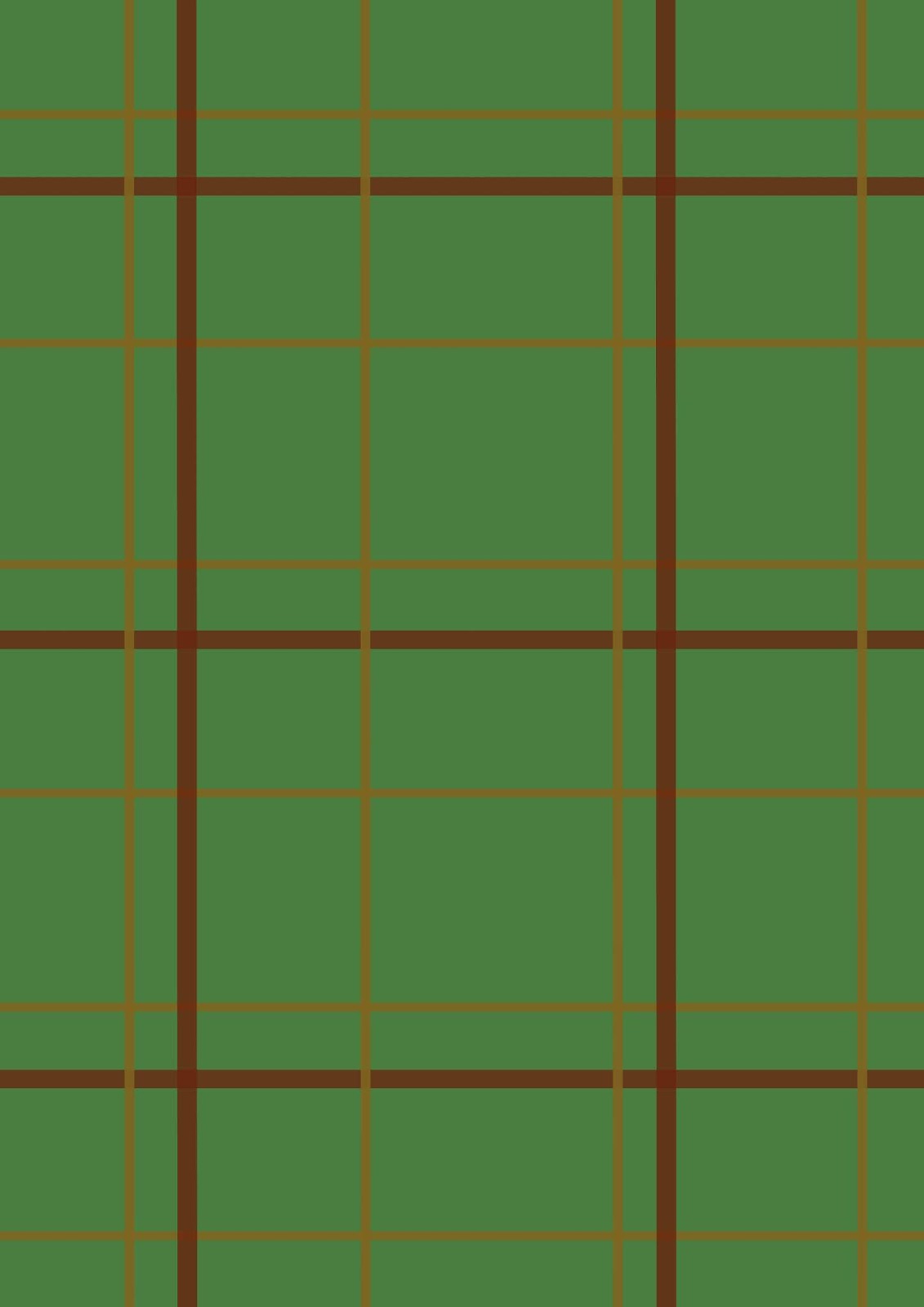
After this, I focused on the inside cover design. I knew I wanted this to be fairly simply, as it lead straight into the first page. For this, I thought of the key imagery I could associate with our book - portal, Gord's coat, paw prints, frames - and started playing with ideas. Firstly, I made a tweed tartan texture (below).

I then came up with the idea of using this page for dedications. I had a think of how best to approach this, and decided to work with the idea of it being Gord's coat, and add a label. For this, I searched for some free for commercial use, no credit textures and set them into my initial layout. I then added little stitches and a bit of tone to make the label stand up. This led me to the final inside cover that you can see below. I'm really proud of this, actually, and think it really works with the theme of the comic.

After this, I focused on the back cover. Initially for this, we had just planned to have it mainly blank (probably black with our contact information at the bottom). But I decided to have a think before settling on this and came up with the idea that - because the from cover is 'framed' - the back cover should be the back of the frame. For this, I had to do a little research into what vintage framing looked like. I used Katy's frame, drew a paper layer over it slightly (and added a royalty free texture), drew in and hand textured some rope and metal fixtures, and then had to consider where we'd put our contact info. I decided it would be cool to have it on a sticky label that had been partially removed, to make it look old. I drew this us myself but using a white rectangle and using an airbrush eraser and fiddling with opacity a bit. Finally, I added the text and a royalty free Instagram logo. You can see the final back cover below.

No comments:
Post a Comment